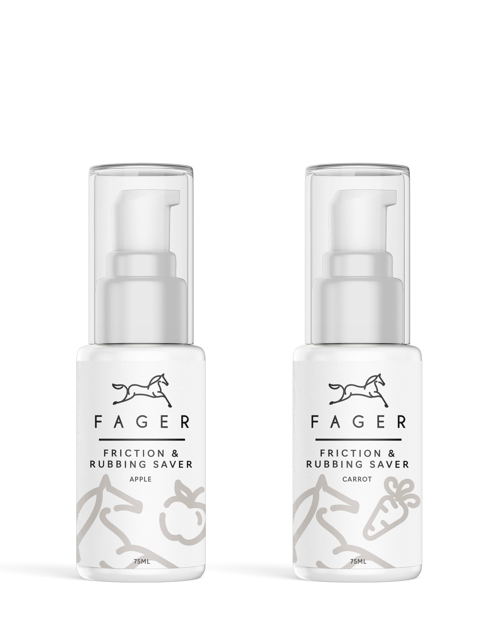
As a graphic designer, I created label
BRIEF
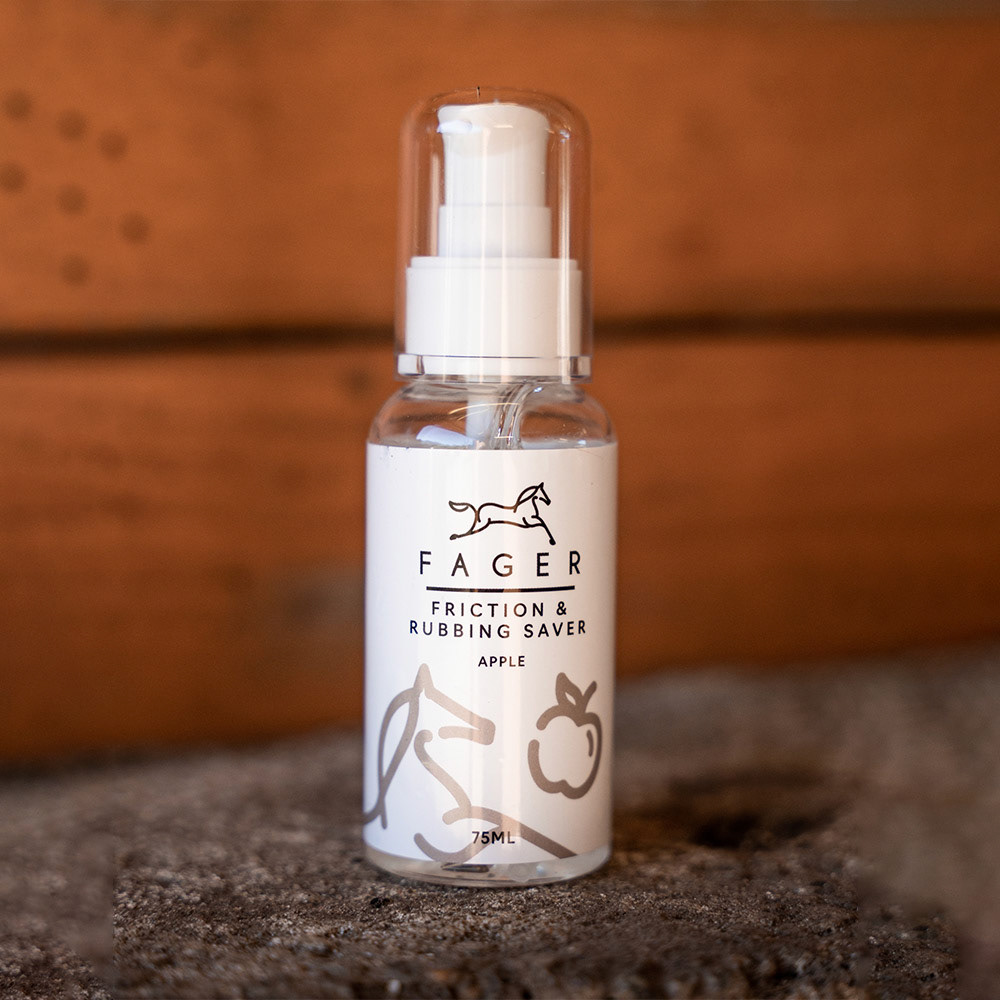
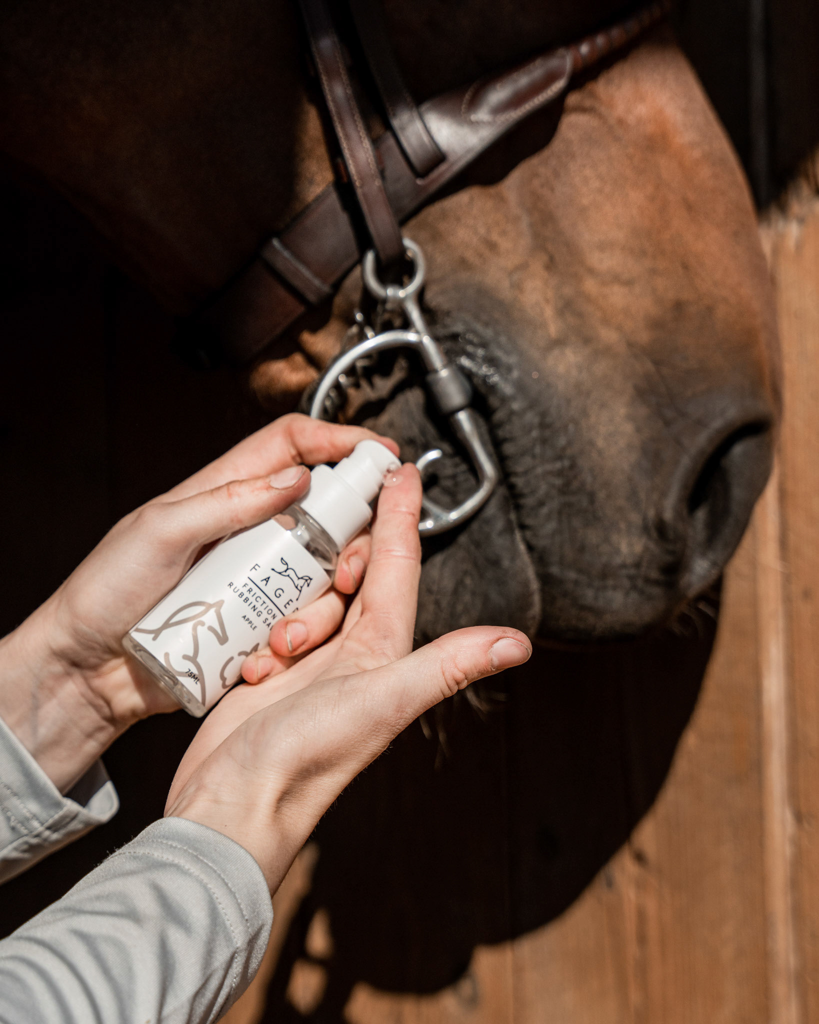
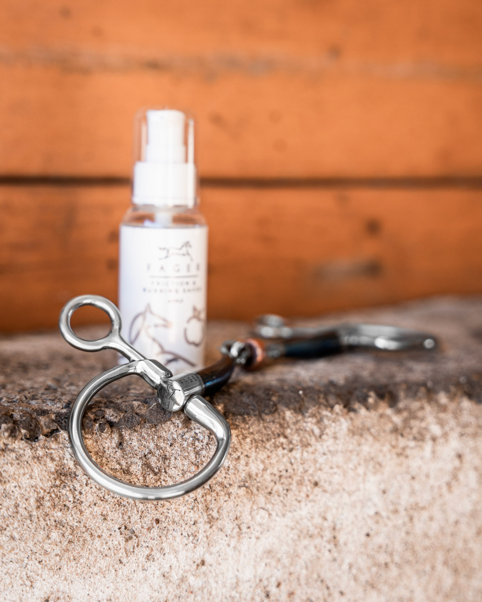
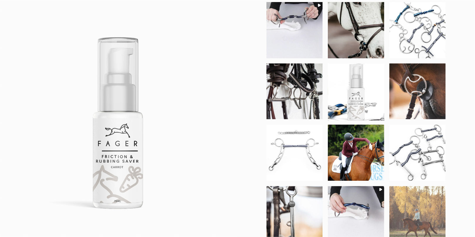
They would like to an updated label for our Friction and rubbing gel bottle. It is a pump bottle, 75ml.
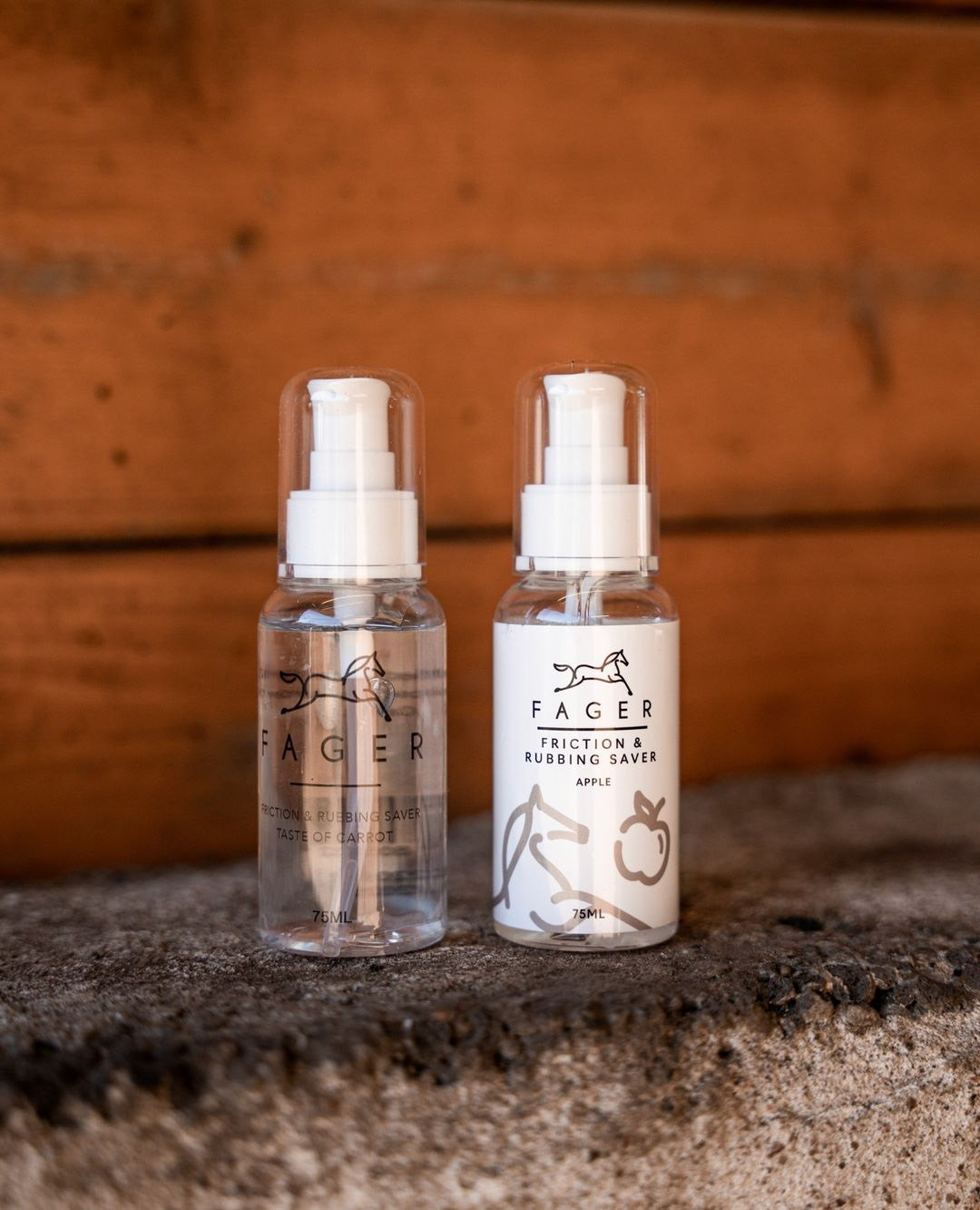
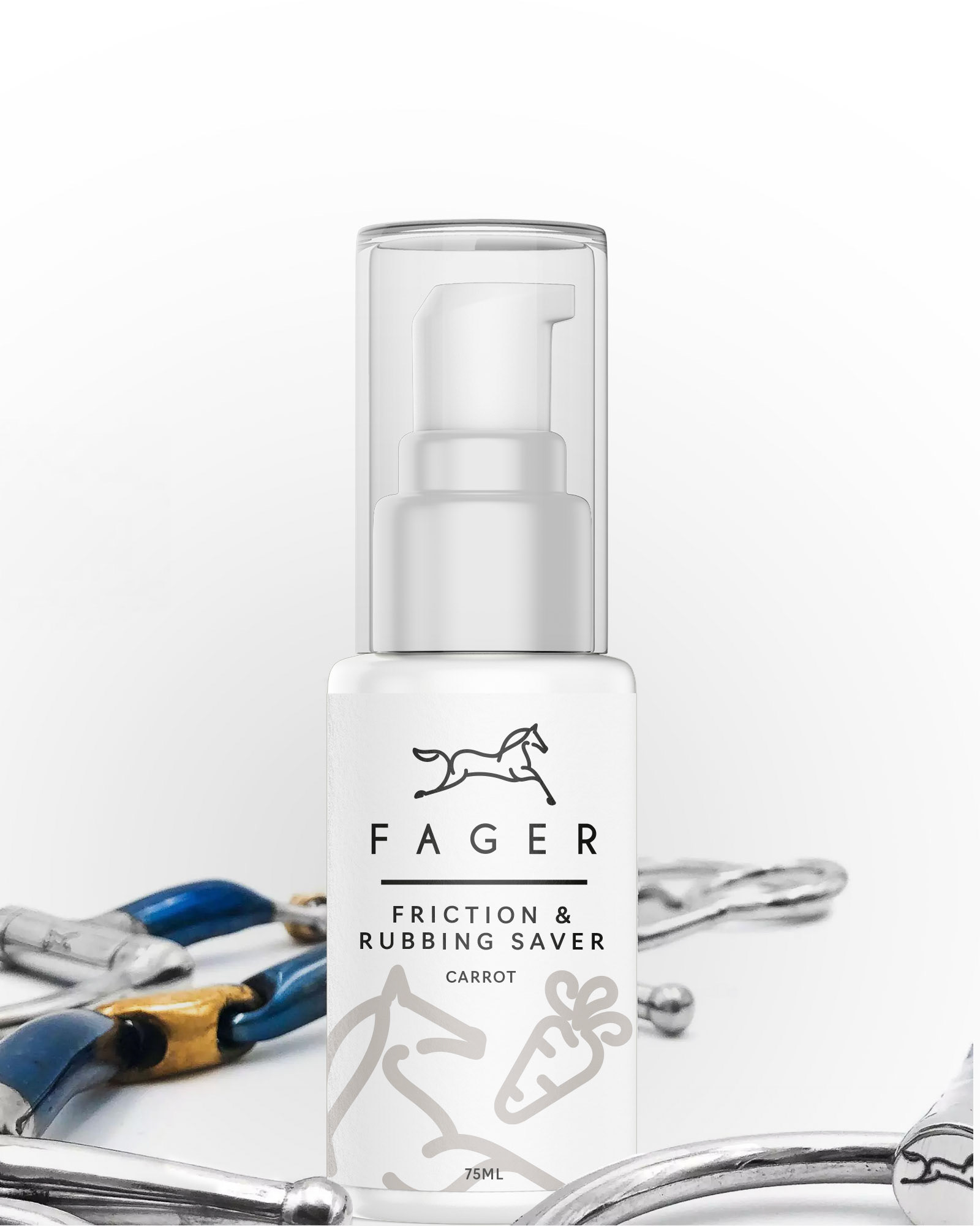
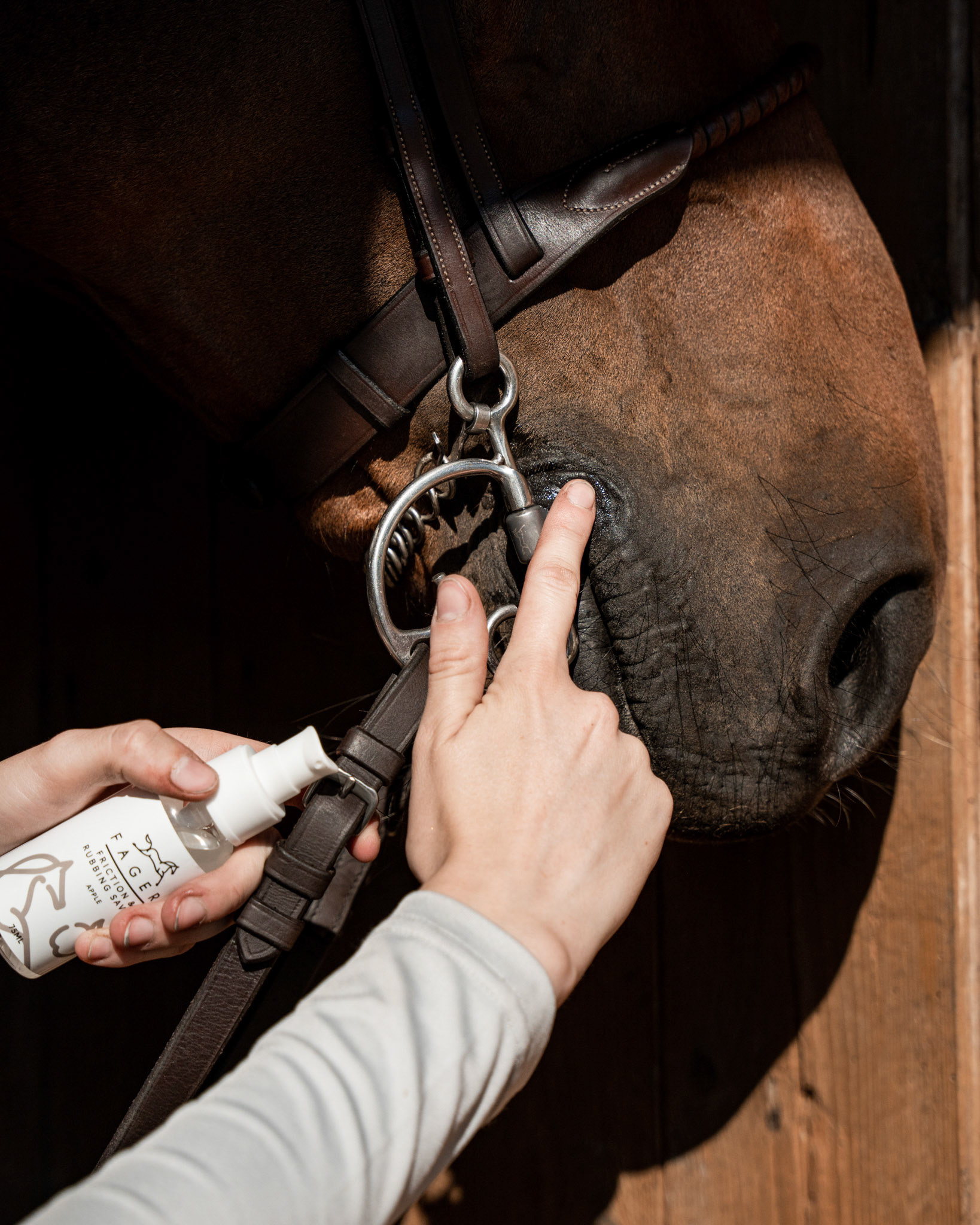
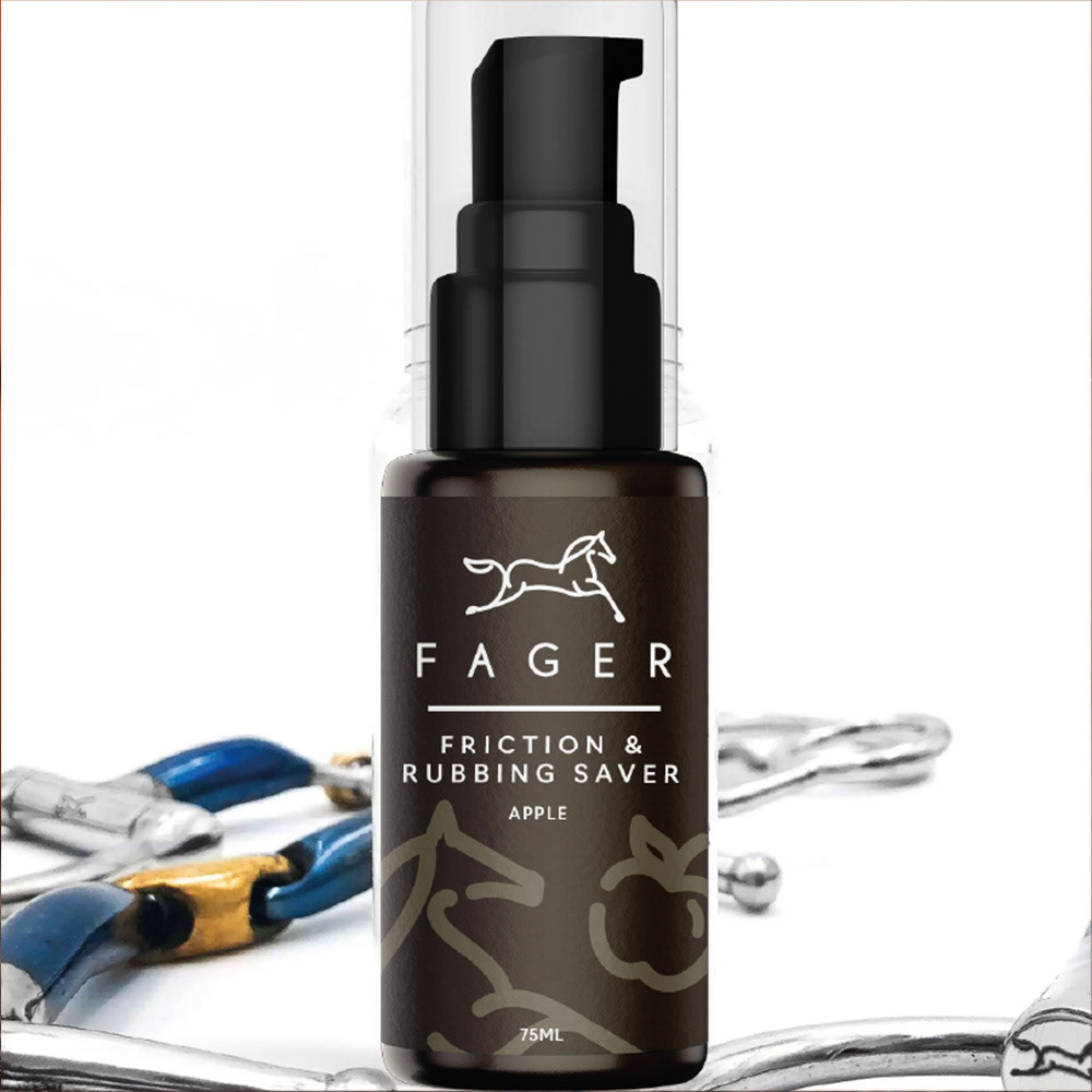
They are launching a new taste with Apple that prevents the horse´s mouthcorners to get wounds and also helps the horse to accept the bit better. So it should both look tastefull, and give a look of a "pharmacy product" you can trust. It could be a bit playful, but also with a touch of serious because of we want to promote it as a "problem solver" product.
Audience: Equestrians that owns a horse, both women and men. Age 20-60. Mostly Women at the age 35-40.
CONCEPT IDEA
The concept is based on a simple behavioral cue:
Horses love the flavor and instinctively chase the apple/carrot.
Horses love the flavor and instinctively chase the apple/carrot.
The apple/carrot elements create a subtle visual chase, suggesting movement and desire without dominating the label.
The scene remains intentionally light and transparent, keeping the product information primary.
The scene remains intentionally light and transparent, keeping the product information primary.
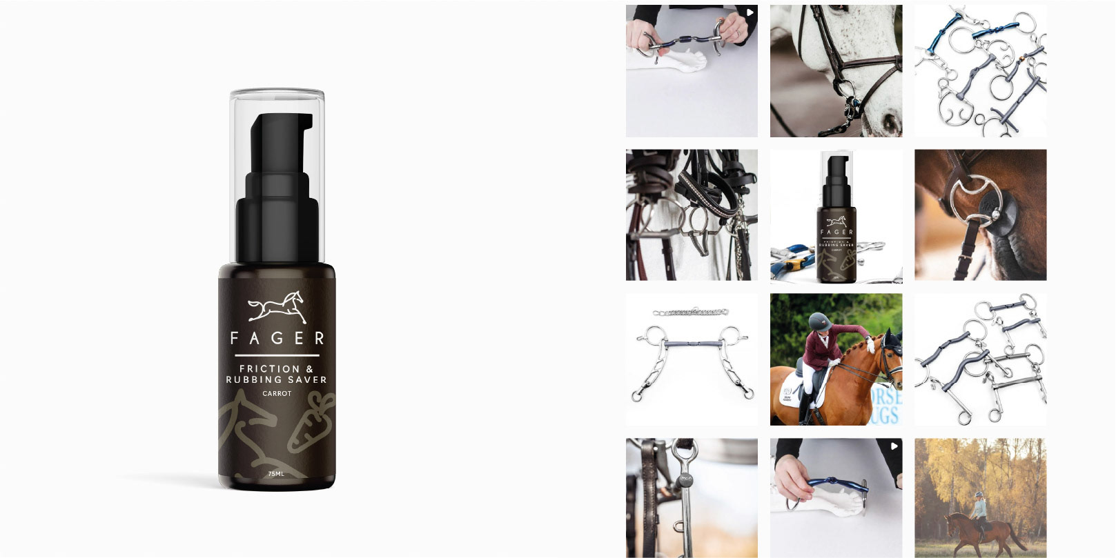
The system is easily adaptable to new flavors by changing only the chasing element.
Compared to the previous label, the logo was reduced and the product name emphasized to improve clarity and readability.


STATS
Timeline: 3 Weeks
Deliverables: I delivered the final files in the following format
• Concept mockup .png
• Print-ready .pdf
• Source file (Editable File) .ai